Overview
This case study describes my process for designing a hypothetical app that provides educational resources and tools for new and prospective electric vehicle owners.
I created this case study for three reasons. First, EV’s are something I’m passionate about. Environmentalism and green technologies are one of my biggest interests, and I wanted to explore how I might solve a problem in that space.
Second, I wanted an example project that showcases many areas of the UX process, and how I would approach each one. Much of my real-world UX work has been more piecemeal; it is rare that I get to exhibit my breadth of skills in a single project. This case study tries to rectify this.
Finally, I wanted to convey what I’ve learned over my nearly seven years of professional UX experience, while not having access to recent design assets. My past two roles were under strict NDA’s, so I don’t have the ability to show the specific work I did for those projects. I can discuss some of the experiences I’ve had if such topics are discussed in an interview, but this is a limitation for showing my skills on my portfolio. Hence, this case study.
Problem Statement and Domain
How might we increase EV education/adoption among new or prospective EV owners when accurate, reliable information is hard to access?
Electric Vehicle (EV) adoption is currently too low to meet national and global emission targets. However, there are many barriers that slow EV adoption. One of the most prevalent is the information barrier; EV ownership can be complicated and counterintuitive to the unfamiliar, and reliable, accurate information can be hard to find.
Current efforts to improve EV education/awareness are scattered among numerous grassroots organizations, charging companies, and motor vehicle manufacturers. This project explores having one place where various types of EV resources and education are available.
Users and Audience
The target audience for this solution is new and prospective EV owners.
As part of my initial literature review and competitive analysis, I identified several potential audiences for this solution:
- Experienced EV drivers
- New EV drivers
- Current ICE car drivers who want to drive EV’s
- Current ICE car drivers who don’t want to drive EV’s
- Sales representatives at car dealerships
- Members of any of the grassroots organizations above
- Representatives from utility companies
- EV manufacturers
From these, I decided to focus my efforts on new or prospective EV owners, as that appears to be where the understanding barrier is highest.
Roles and Responsibilities
I would work on a project team, alongside a product manager, a tech lead, a UX researcher, a UI designer, a content writer, and a team of software developers.
For this project, I assumed I would be working as part of a larger product team. On this team, I would be the lead (or sole) UX designer. I would be responsible for owning the UX vision for the project, advocating for the user’s needs throughout the product lifecycle, and answering the discovery questions we have laid out. I would also facilitate ideation sessions, create and test prototype designs, and collaborate with other team members to finalize and implement the solution.
I would be working alongside a product manager and tech lead, forming the discovery triad for the team. Our joint responsibility would be to decide which problems our team will try to solve, which solutions to pursue, and how to implement those solutions.
Several other roles would contribute to the project. A UX researcher would work alongside me to define discovery questions, conduct additional user interviews and testing, and define analytics for the project. A UX content writer would provide guidance and copy for button labels, tooltips, help text, documentation, etc. A UI/visual designer would help determine which design system components to use in the solution, and would create any more detailed specification documents as needed. Finally, a team of software developers would implement the finalized design in code.
Scope and Constraints
I determined two main goals for this solution: to increase EV awareness and education, and to increase demand for EVs. Based on these goals, I identified research assumptions and design constraints, which will drive the rest of the discovery and design process.
Goals
After concluding my initial literature review and competitive analysis, I decided on two primary goals for this project.
The first goal: Increase EV awareness and education. This would have the following impacts:
- Overcome barriers to understanding EVs
- Reduce misinformation about EVs
- Reduce EV “detractors” (people who push back against EV adoption)
- Produce more educated consumers
The second goal: Increase demand for EVs. This would have the following impacts:
- Improve EV infrastructure
- Increase EV sales
- Help the environment
Assumptions
Based on my initial findings, I identified many assumptions about our problem space. These would need to be tested as part of our interviewing and prototyping process.
- Raising EV awareness/education with the average consumer will have a positive impact on EV adoption
- Targeting the average consumer with our solution with have the greatest positive impact on EV adoption
- The average consumer is unfamiliar with the benefits of EV adoption
- The average consumer is unfamiliar with how EV’s are different from ICE cars
- The differences between ICE vehicle ownership and EV ownership cause friction for new adopters
- EV’s have a steeper learning curve than ICE vehicles
- The average consumer is affected, at least partially, by EV misinformation
- Misinformation about EV’s is mostly negative
- Misinformation spreads more quickly and easily than accurate information
- Misinformation reduces EV adoption
- Misinformation is often spread by those who do not want EV adoption
- Current strategies for combating misinformation rely heavily on “word of mouth” messaging
- Misinformation is most damaging for the average consumer
Constraints
I defined design constraints to provide structure for an ideation exercise. The goal was to brainstorm a solution to my problem statement, that would also help test some of the assumptions. I grouped these constraints into “must-have” and “nice-to-have” categories.
Must-have constraints:
- provide reliable, accurate, trustworthy information to the user
- be usable and understandable by the average consumer
- demonstrate the practical/economic/environmental benefits of EV adoption
- educate users about EV’s (use, care, maintenance, charging), as well as dispel misinformation
- be easy to access information at any time
Nice-to-have constraints:
- is a software application
- mobile-first design
- ability to send information to others
- embedded as part of other websites/applications
- provide resources for evaluating the cost of EV’s
- locating charging stations
- information about EV price incentives in the user’s area
Solution Hypothesis
We believe that a mobile app with educational material and resources will improve EV awareness and adoption for new or prospective EV owners.
Process
Empathize
Conduct Literature Review
My empathy work began by reviewing existing material on the subject of Electric Vehicles. I discovered numerous barriers to EV adoption, including the information barrier.
I conducted some initial research of articles, blogposts, and videos, in order to familiarize myself with the problem space. This is my preferred method for beginning the empathy process, as it requires a small amount of investment to yield a plethora of information. I prefer to leverage more scholarly literature, if it is available. From this, I was able to discover many current barriers to EV adoption, as well as several common misconceptions about EVs.
Perform Competitive Analysis
I researched other organizations that are working to further EV awareness and education, to evaluate the viability of the competitive space.
I also investigated several other organizations and companies that shared my goal of increasing EV awareness, to learn more about their practices and their results. I’ve found competitive analyses to be quite useful, not just in terms of borrowing ideas, but also in identifying whether a problem space is worth pursuing due to the competition. In this case, I found that most EV advocacy is done by grassroots volunteer organizations, charging companies, and motor vehicle manufacturers.
Write Interview Scripts
I prepared an interview script to use with potential research participants, so that I might learn first-hand about the problems faced by new EV owners.
After my personal research was concluded, I began planning for a (mock) interview process. I determined potential testing participants (see above), and wrote a list of questions to ask during an interview with one such participant group. Speaking to people is the most critical step in my empathy-building process. I need to hear the story right from the source, and that means directly interviewing users (preferably in a one-on-one setting). It’s the most effective way to answer questions and identify problems to solve, and it fosters a crucial understanding of the people I’m designing for. Note: due to the limitations of this project, I was not able to conduct user interviews; such interviews would likely change the designed solution.
Define
Write Problem Statement
I created a problem statement to succinctly describe the focus of my work.
Guided by my empathy-building work, I defined a problem statement (see above). I have frequently used problem statements as a focal point for design work. They ensure everyone on the team has a clear understanding of the problem we want to solve, who we’re solving it for, and the main obstacle that makes this problem difficult to solve. Such a statement is useful for communicating with other teams and stakeholders, and serves as a measuring point for all design solutions we consider.
Identify Assumptions
I identified research assumptions to clarify what I needed to know to produce an effective solution.
As stated before, I identified numerous assumptions that I was making about our problem space, based on my initial empathizing exercises. Assumptions are critical to accurately understanding the problem space. They are conjectures, speculation, things that we believe are true, but we haven’t confirmed yet. They effectively serve as the to-do list for our discovery work. Note: some of these assumptions would have been confirmed or refuted based on any pre-design user interviews I would have conducted.
Define Constraints
I defined design constraints to act as guardrails for ideation, and to ensure that the solution aligned with the problem statement.
As mentioned above, I created a list of constraints. These are attributes my solution must have (or could have) in order for it to be able to solve the problem presented in the problem statement. These constraints also enable the ability to test some of the research assumptions. As necessary parts of a design, they provide structure for ideation sessions. I have found guided ideation to be much more productive than completely freeform, prompt-less brainstorming. Constraints are the skeleton upon which a design is built.
Ideate
I planned and conducted an ideation session to generate material with which to design a solution.
Plan Ideation
With my problem space sufficiently defined, I was ready to begin ideation. Because of limitations in time and resources, I planned out the following ideation rules:
- sticky note brainstorm
- 10 minutes
- compare to constraints/problem statement
- cluster related ideas
I strive to tailor the ideation session to the needs of the project. In this case, I chose to write basic ideas on sticky notes, because it would allow me to create a lot of ideas in a very small amount of time. Further, it abstracted the ideas away from specific UI designs, allowing for a greater flexibility in the type of ideas generated (which is more appropriate for an early-stage design like this). In other cases, ideation might be conducted by sketching potential interface elements, which is more useful when one is improving or innovating a pre-existing solution.
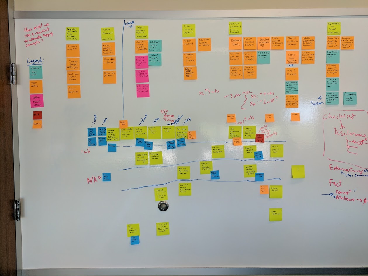
Conduct Ideation Session
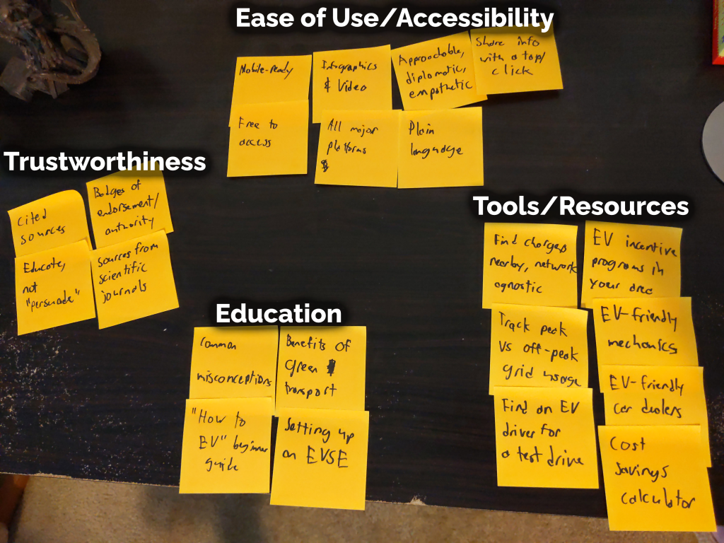
After I ideated for 10 minutes, I clustered related ideas (see below) and compared them to my constraints. Overall, the ideas generated seemed to align with the constraints. By clustering related ideas, it becomes easier to identify patterns, which could serve as inspiration for potential designs.
Prototype
Write Solution Hypothesis
I wrote a solution hypothesis to explain how I might know whether the solution is successful.
Based on my ideation and the patterns of ideas created, I wrote a solution hypothesis. This articulates what the proposed solution would be, what value the solution will provide, and who the solution is for. A solution hypothesis is a useful communication tool with the team and with stakeholders, and provides a means to gauge the success of the solution. By producing and testing a design, one can see whether the hypothesis holds up. Depending on the nature of the project, I might also include metrics by which I could quantitatively measure the success of the project (for this project, I lacked sufficient information to determine which metrics to measure).
Create UX Flow Diagram
I created a diagram of the parts of my solution to act as a blueprint for more detailed prototype design.
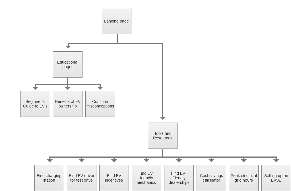
I began my prototyping process by creating a basic flow diagram. This shows the high-level parts of the solution, and describes the basic flow of the user through the experience. I create these diagrams to provide a structure for my prototyping, so that I know which screens to make, which states to account for, and how everything connects together. In some cases, more detailed information is added to the diagram, including how data flows across screens, any dependencies from external systems, entry and exit points, choices the user could make, etc. As I created this diagram, I realized that it would be more logical to recategorize one of the elements that was previously identified in the ideation. This is reflected in the diagram (below).
Create Low-Fidelity Prototypes
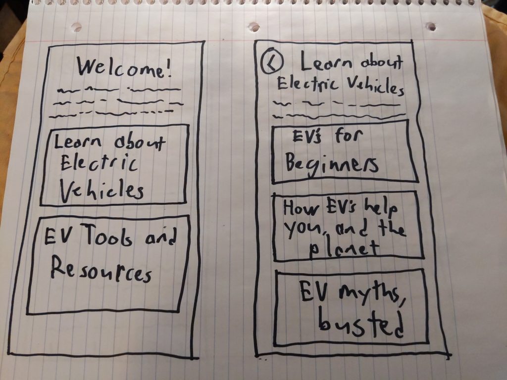
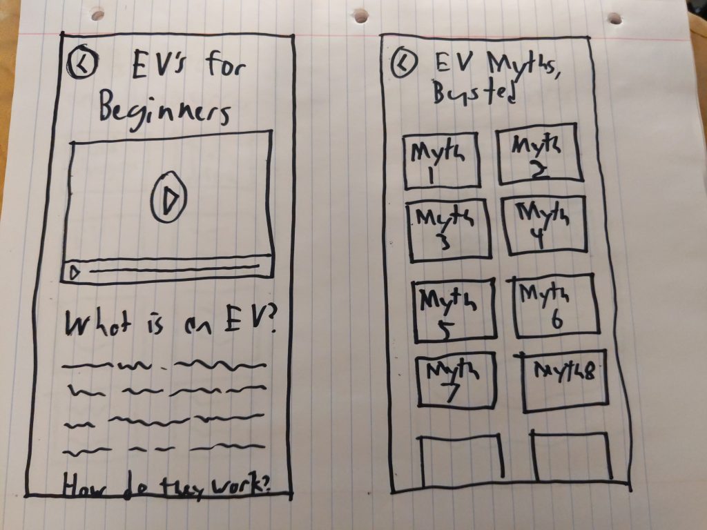
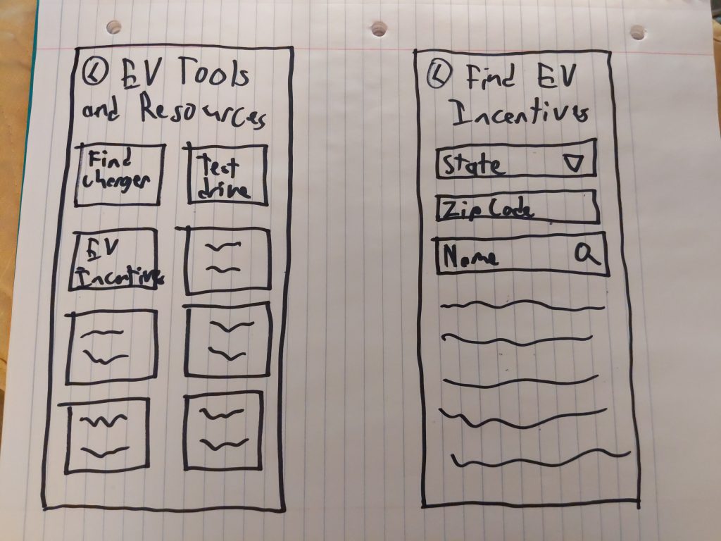
I prototyped the first iteration of the solution in paper, so that I could quickly capture high-level ideas.
With my diagram complete, I had a rough outline with which to create prototypes. I began with paper, because it allows me to capture high-level ideas quickly, without worrying about details such as color or button alignment. It also presents an opportunity to plan things like navigation and information hierarchy. I created the prototype screens below.
Create Mid-Fidelity Interactive Prototypes
I created my second prototype iteration in Axure, so that it could be tested with users.
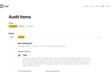
From there, I moved into Axure to create the next iteration of prototypes. Axure is the prototyping tool I have the most experience with (and the only one that I own), though I have more recent professional experience with Sketch, InVision, and Figma. The goal of this mid-fidelity prototype was to create something that could be tested with users. I like to test using mid-fi prototypes because it makes it much easier to convey interactions. It also looks more like an actual software application, which gives the design more credibility with the testing participants.
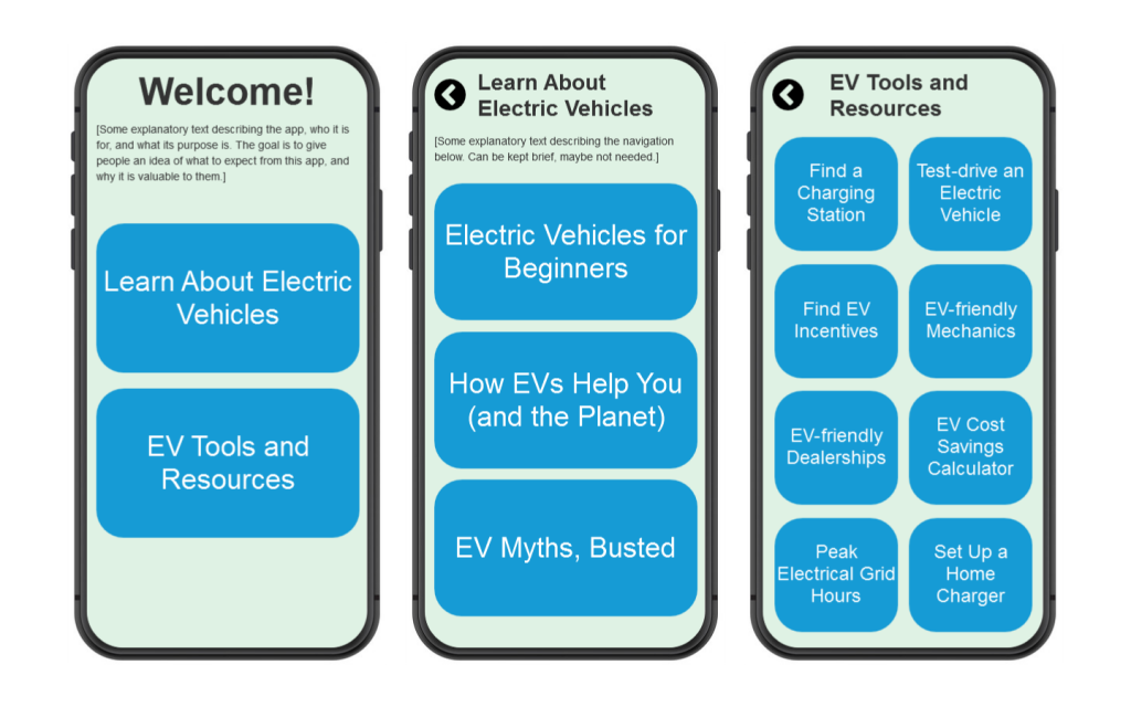
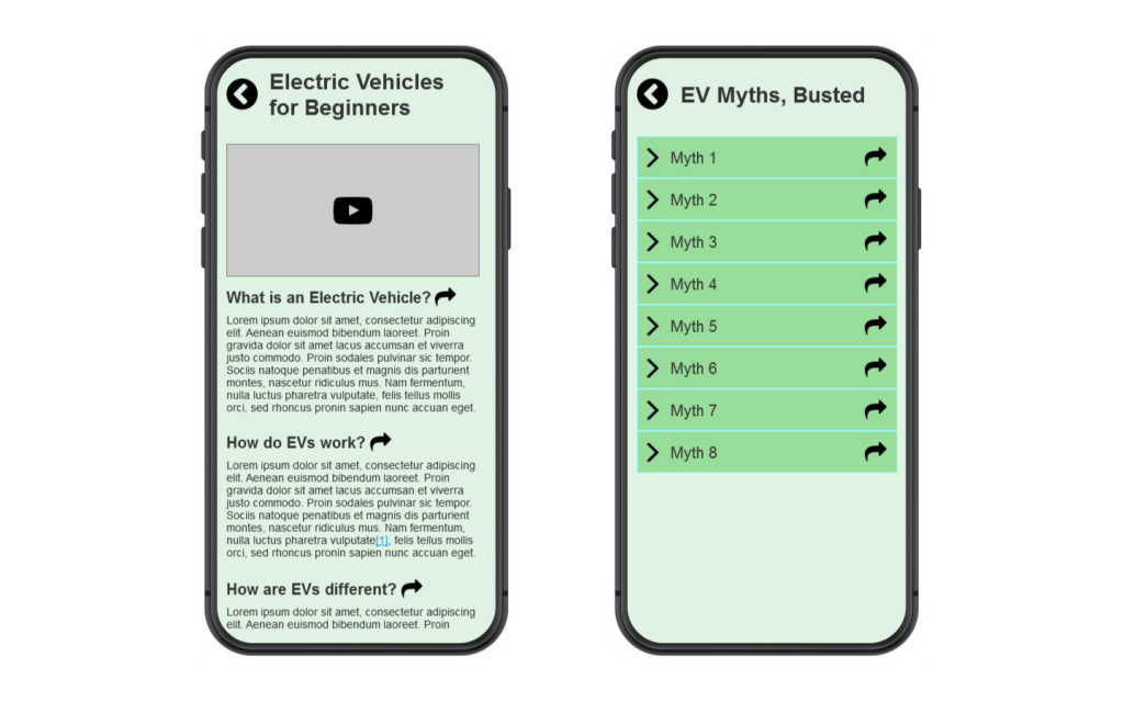
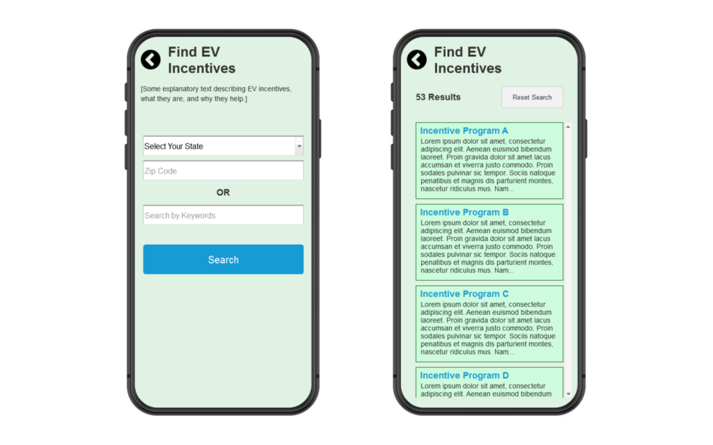
Note: I purposely did not spend much time on visual polish during prototyping (beyond removing distractions) for two reasons. First, this was to be the first round of prototypes that I would test with users, so I saw no need to put a lot of effort into visuals if the design would potentially change. Second, I am assuming that I would have access to a design system for this project; in such a case, I would either use the pattern library components directly in Axure, or I would specify which components to use (with the guidance of the UI/visual designer) after testing is complete.
Test
Write User Testing Scripts
I wrote a script for user testing to ensure that participants would have a high-quality, consistent testing experience.
With my prototype complete, I wrote a testing script to accompany the prototype during user testing. I write test scripts to give all participants a consistent experience, allowing me to more easily compare responses between them. It also gives me time to word my questions and tasks in a way that does not lead or bias the participants; this is a much greater risk if user tests are improvised. In test scripts, I make sure provide clear disclaimers about the nature of the test (e.g. “we are testing the design, not you”), word my tasks in a way that users can figure out a path forward based on the information presented onscreen (without spelling out exactly what to do), and specifically ask them for things they didn’t like about the experience. The testing script can be found here.
Conduct Testing
I would conduct user testing sessions with 6-8 participants, and then catalog their findings for use in subsequent design iterations.
I try to test my designs with 6-8 participants, as this provides enough diversity in perspective to reduce individual biases, while still being manageable by a small team in a tight timeframe. I would work alongside the UX researcher on the team to recruit participants and schedule testing sessions. Each session could be between 20-60 minutes in length, depending on the script (for this project, I would expect about 30 minutes). Two team members would attend the tests; one would read the script and conduct the activities, and the other would take notes (additional remote observers could be possible). I would likely be one of them; I consider user testing to be one of my strengths. If possible, we would also try to record the testing session in some capacity (audio, screens, etc.).
After a round of testing is complete, I would collect all the user testing feedback and compile it together. I would look for patterns between the responses, make note of any outliers, and categorize the types of feedback (e.g. positive, negative, bugs, feature requests, etc.), to make it easier to comprehend. Some of this feedback would be distilled into key takeaways to share with stakeholders. Once synthesized, the feedback would be used to inform the next round of prototype updates. This cycle of design-test-synthesize would repeat until there is minimal negative feedback, at which point the design is ready for development (any other feedback would be recorded for future updates).
Additional Processes
Design System Planning
I would collaborate with UI/visual designers to determine which Design System components to use in the solution.
Early into the prototyping process, I would meet with the UI/visual designer to discuss design plans for project. I would let them know what kinds of interactions I am considering, and what functionality to provide (and why). We would work together to determine which Design System components to use to accomplish the desired interactions. I try to meet with UI/visual designers early on, because that gives them an opportunity to provide early feedback on componentry, which minimizes design rework once the solution is ready.
If available, I would use the library of Design System patterns in my prototyping software (Axure, Sketch, Figma), to minimize rework and simplify prototype creation. If the solution is using the correct components from the start, there will be less burden on the UI/visual designer.
Once prototype testing is complete, I would create a version of the prototype that showcases all intended interactions clearly, so that the UI/visual designer can use it to create any specification documents as needed (ideally, just specifying which components and properties to use, in such a way that developers know what to implement).
UX Content Planning
I would collaborate with UX content writers to define the content needs for the solution.
Early into the prototyping process, I would meet with the UX content writer to discuss design plans for project. I would let them know what kinds of interactions I am considering, and what information we need to convey (and why). I would work with them to determine the content needs for the application (button labels, tooltips, help text, etc.). As with UI/visual designers, I try to meet with content writers early on, to provide an opportunity for feedback, which minimizes rework.
Also in the spirit of reducing rework: If available, I would reference the content Style Guidelines when prototyping. Throughout the prototyping process, I would check in with the UX content writer to update any content in the prototype as needed, and would confirm with them that the final content is in place before finishing prototyping for the UI/visual designers.
Writing Developer Tickets
I would construct tickets to break down the finalized design solution into develop-able pieces.
Once any visual specs are completed, I would create development tickets from the specs/prototypes (I have experience with Notion, Azure DevOps, Trello, and JIRA). I would strive to make as few changes per ticket as possible. It’s better to have many tickets that each do small things, rather than one big ticket that contains many changes (as that would take longer to implement and merge).
As I write the tickets, I would take prototypes/specs and cut out material that is not relevant to the current ticket (usually via cropped screenshots). If specific micro-interactions need to be explained, I would create screen-capture videos to show them.
When writing acceptance criteria, I like to specify which components will be used to achieve the results, and use specific component properties, icon names, color values, and UX content, to make things as clear as possible. I would link to any other relevant tickets, associate to any relevant epics or projects, and, if available, tie the ticket back to a specific user insight or UX team Design Principle. These points of context explain why a ticket is important, and what the developer’s specific effort contributes to. Every ticket needs a purpose.
Defining Analytics
I would collaborate with UX researchers to determine the analytics needed to track the success of the solution.
Early into the prototyping process, I would meet with the UX researcher to discuss plans for analytics and follow-up. I would explain what user needs our solution will meet. Together, we would determine how we will measure the success of our solution, define the discovery questions we hope to answer using analytics, and schedule a timeframe for follow-up (usually 1-3 months after feature launch).
Outcomes and Lessons
Outcomes
As this was a hypothetical project, I was only able to take the design process so far. However, I believe that the prototype and test script are in a place where they could be tested with users. This would provide valuable feedback into the beliefs and behaviors of new and prospective EV owners.
Lessons Learned
Have a narrow target audience. The smaller your niche, the more specialized a solution can be, and the more problems a solution can solve for that niche. I’ve learned that it is better to support a small audience in a big way, than to support a big audience in a small way.
Start with a small scope, and then expand. As is the case with your niche, I found that focusing one’s efforts on making a few really good solutions will yield better results than trying to solve many problems simultaneously. The initial high-quality solution provides a foundation for later successes.
Not all assumptions can be tested with a single design. I identified many research questions and assumptions, far too many to be able to verify in one user testing session. By prioritizing and spreading out the discovery work, one can answer the most important questions first.