Overview
At Flexion, I led the design of a modernized case management system for a government organization, to drastically improve their effectiveness and productivity.
Flexion partnered with the United States Trustee Program (USTP) to aid in its efforts to modernize its case management system. As part of its role of providing oversight to the US bankruptcy system, USTP relied on a legacy case management system to track case information. Not only was this system difficult and expensive to maintain, but it had significant usability issues and a steep technical learning curve. Further, there were many variations in process between the many USTP offices throughout the country.
The modernization effort sought to address all these things. We created a new case management system, using modern cloud-based technology. Our focus was on usability, productivity, and consistency between offices. The intent was to create a powerful, optimized system that USTP could easily manage and maintain in the future.
Problem Statement
How might we enable USTP staff to effectively and efficiently provide oversight of the bankruptcy system when organizational systems and processes are so varied?
User and Audience
This solution was for government employees who provided oversight to the US bankruptcy system.
The main users of the case management system were USTP staff members. These people worked on cases at various points in the oversight process. Trial attorneys, for example, are responsible for appearing in court on behalf of USTP when bankruptcy cases go to court. Bankruptcy Analysts and Paralegals perform data analysis and review of cases. Assistant US Trustees are responsible for generally overseeing the affairs of an office, and for assigning staff members to cases. And Data Integrity Specialists are tasked with ensuring that case information is correctly ingested and categorized in the case management system.
Roles and Responsibilities
I collaborated with a Product Manager, Tech Lead, Product Owner, and development team on the discovery, design, and implementation of the case management system.
In my role at Flexion, I was a Senior Lean UX Researcher/Designer and the sole UX professional on the USTP project. I worked alongside our Product Manager, Product Owner (from USTP), and Tech Lead to jointly determine the priority and direction of the team. Our team also included a small group of Full-Stack Developers and DevOps engineers, as well as a few employees from USTP’s IT department (our PO, two engineers, and a contract manager).
As the UX expert on the team, I was responsible for leading both the discovery and the design efforts of the project. For the discovery effort, I planned and conducted user interviews with USTP staff to gather user needs, facilitated Subject Matter Experts in a weekly discovery meeting to further flesh out business needs and requirements, conducted User Story Mapping sessions to drill into specific processes, and used Affinity Diagramming to compile and synthesize findings from multiple discovery efforts. In the design process, I facilitated ideation sessions, created Figma prototypes of our solution, planned and conducted user testing sessions, and collaborated with developers as part of implementation.
Scope and Constraints
Our solution had to meet complex user and business needs, using modern open-source software.
For our project to be considered a success, we had to meet several goals. The resulting solution had to be made using modern, cloud-based technologies, and created in an open-source codebase owned by USTP. More centrally, the modernized case management system had to fully support the numerous tasks that USTP performs as part of bankruptcy oversight.
Challenges
This proved to be challenging for a few key reasons. First, the bankruptcy system itself is complex, defined by years of laws and government policies combining together (both federally and at the state level). A big source of this complexity comes from the differences between the various chapters of bankruptcy (e.g. chapter 7, chapter 11, chapter 15, etc.), and how the bankruptcy code applies to each.
Second, these nuances are further exacerbated by the process variations between the different USTP field offices, which are informed by the bankruptcy court districts and divisions they support. This often meant the same process was handled completely differently between two different offices.
Finally, we had to support a user base that had a high degree of subject matter knowledge, but varying degrees of technical expertise. This required us to become very familiar with the aforementioned nuances, so that we could properly communicate with users in the system. This was done while also keeping the technical learning curve as gentle as possible.
Process
Discovery Preparation
I prepared for each new discovery effort by writing a problem statement, and a list of unanswered questions and unvalidated assumptions, to define the scope of research.
When beginning a new discovery effort, I wrote a list of questions that I had about the problem space, as well as any assumptions that I had about how things worked. I also wrote a problem statement for the feature/problem space, using the form “How might we [enable X users] to [do Y task] when [Z thing makes it difficult]?” The intention was to build a framework for understanding the problem space. By identifying knowledge gaps up-front, we were able to determine who we should interview, and what about, and create useful interview questions. The problem statement was used to scope the endeavor, to clearly identify the problem we wanted to solve, for whom, and the key obstacle in our way.
Exploratory Interviews
I conducted many rounds of interviews with government staff, to answer my questions and validate/refute my assumptions.
We interviewed USTP staff members throughout the development process, to discover and clarify user needs. When starting out, we conducted initial interviews to better understand the problem space, as well as a second round dedicated specifically to identifying user pain points. When we began work on a specific use case or process, or when we focused on a new bankruptcy chapter, we interviewed users tied to those processes, to answer any discovery questions we had. We did this to learn from the people who were directly involved in the day-to-day process of bankruptcy oversight; they were the ones who would be using our solution, so their needs drove our decision-making.
Synthesizing Findings
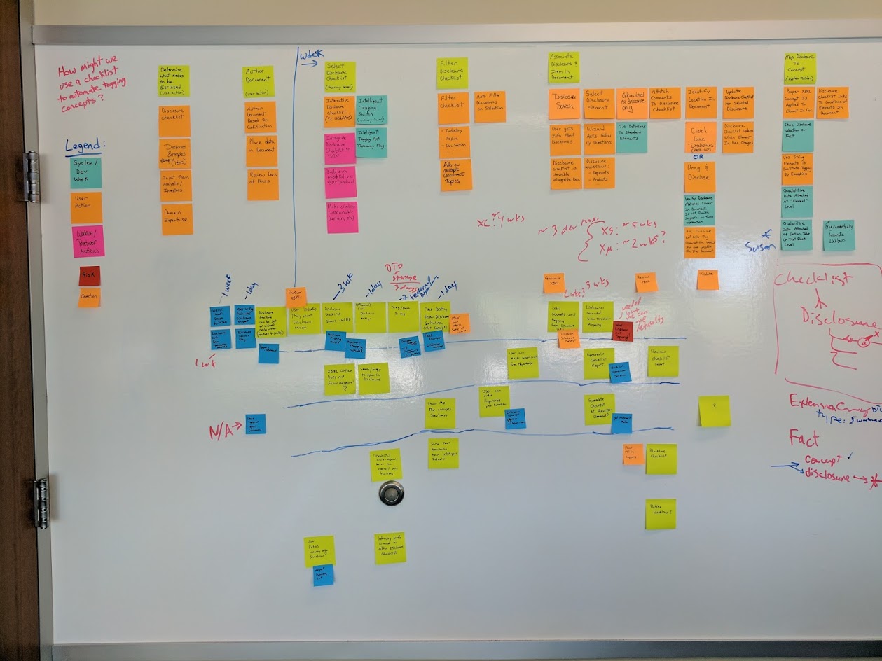
I ran affinity diagramming sessions with my team to synthesize insights from research data, and user story mapping sessions to detail complex processes.
After each user interview or user test, the team members in the session would meet to debrief and compile our shared notes. Then, when we completed a round of interviews or tests, I would conduct an affinity diagramming session with the project team. This involved writing our interview findings down on (virtual) sticky notes, and then grouping them together into categories based on related themes. These themes were then used to inform design/product decisions, as well as identify opportunities for further discovery. This process was done collaboratively, so that everyone on the team could gain an understanding of our user’s needs and pain points.
For some of the more complex processes, I conducted User Story Mapping sessions with specific users. In those sessions, we would step through the complex process bit by bit, and identify sub-steps and permutations along the way. This allowed us to have more granular detail about the process, to help prioritize feature development for that process in the future.
Weekly Discovery Sessions
I held weekly sessions with subject matter experts to explore process details and get quick design feedback.
A key part of our discovery and design process was our weekly meetings with subject matter experts. These were USTP staff members, across various offices and roles, tasked with providing our team with knowledge and insight into the workings of the bankruptcy system. In these meetings, we would share progress updates on development, as well as address design/discovery problems. This often meant having a discussion about the details of a bankruptcy process and how it might be solved, or sharing high-level design ideas to get quick feedback.
Design Studios
I conducted Design Studios with my team and our SMEs to generate ideas and begin the collaborative design process.
When we began work on a user story, if we identified a significant design effort as part of that story, I would schedule a Design Studio to begin work on a solution. This was a collaborative design exercise in two parts. First, we would have a multi-stage ideation session, leveraging a Liberating Structure (specifically a modified 1-2-4-all method) to generate ideas individually, and then as a group. Then, I would use our ideas to begin designing a solution in Figma, with input from the rest of the people in the studio as I went along.
For each of these Design Studios, I aimed to have a reasonably large number of participants (usually at least 8, myself included) across many disciplines: UX, product, dev, and subject matter experts from USTP. This ensured we had a variety of perspectives and experiences looking at the problem, to help prevent important considerations from being overlooked.
Digital Prototyping
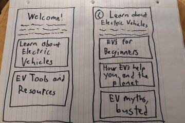
I prototyped our solutions in Figma using USWDS, collaboratively with my product team.
With a clearer problem space and generated ideas, I prototyped our solution in Figma. I broke our project down into sections, based on features. For a given feature, I built out the various screens and states that applied (including empty states, error states, loading states, etc.). I made heavy use of grids and spacing units to ensure everything was properly aligned. Where components could be reused, I would make components, or leverage them from our design system.
Specifically, we leveraged the United States Web Design System (USWDS) to design and build our solution. This allowed us to build screens quickly and focus on the interactions that matter, as many of the smaller design choices (icons, colors, components) were made for us. Further, USWDS has undergone extensive accessibility testing, so many aspects of my accessibility audit (see below) were already handled by our design system.
The prototyping process was very collaborative; instead of working on designs in isolation, we aimed to design things as a team. I produced the prototypes myself, with other team members present in the virtual room (we used SoWork for collaboration) to provide feedback and suggestions as I worked. This allowed everyone on the team to have input on the design of our product, increasing team ownership of our solution.
Usability Testing
I validated design prototypes with users in moderated testing sessions, or by getting quick feedback from our subject matter experts.
When a feature or experience was designed to sufficient completeness, I validated the design with our users. This was to verify usability, and to ensure the solution met business needs in a way that made sense to the people who would eventually be using it. I used two primary methods for validating designs.
If the solution or design was small enough, I would simply share the design with our subject matter experts (whether in our weekly discovery meeting, or in our Teams channel) to get their quick feedback. This was usually sufficient to answer our questions and move forward with the user story.
If the designed experience was larger or more elaborate, I would conduct moderated user testing sessions. We would collect a list of participants (ideally five to eight), and schedule individual usability tests with each person. I would write up a test script for the session, to ensure consistency between tests. After reviewing the prototype and the test for errors, I would meet with each participant, along with at least one other person (they worked as a note-taker and would ask follow-up questions). I would run the user test, giving the participant a list of tasks to complete using the prototype.
After the tests were over, we would affinity diagram our findings (see above), and use those to drive changes to the design. Then, we would decide if there were unanswered questions with our design, or if there were big untested design choices. If so, we would conduct another round of testing. Otherwise, the design would be ready for implementation.
Collaborative Development
I provided guidance and feedback during development, working collaboratively with the team instead of handing designs off.
Our development process was as collaborative as our design process. We broke our features into user stories, to make manageable small chunks that provided clear user value. I was present in the virtual room (via SoWork) while user stories were being implemented. This allowed me to provide clarification and guidance on my designs, and answer questions as things were being worked. It also meant I could provide feedback right away, without the devs needing to wait to show their work. This eliminated the need for detailed visual specifications or lengthy design reviews.
Further, development was started in tandem with design, rather than one waiting for the other to finish. Our workload was structured to have tasks that the developers could do while discovery was in progress or designs were being fleshed out. This helped prevent UX from being a blocker for development.
Accessibility Testing
I performed accessibility audits of our application features as we developed them.
A key part of our team’s Definition Of Done for a user story was Accessibility Testing. It is a skill that I really leveled up at Flexion, by taking Marcy Sutton’s “Testing Accessibility” course. I performed the accessibility reviews at the conclusion of each user story. As this was a government application, we were bound by Section 508 compliance, so accessibility was a must-have.
I conducted this review using several tools. To ensure a feature’s compliance with WCAG 2.2 AA Standards, I leveraged Axe DevTools and Accessibility Insights For Web. They allowed me to perform detailed audits of our app’s accessibility, and generate reports that could be shared with the dev team for updates. Further, I would perform a more qualitative review of the features by navigating them with just a keyboard, and with multiple screen readers (specifically VoiceOver and NVDA). The goal was to go beyond WCAG compliance, and find opportunities to further improve the user experience of people who use assistive technologies.
Solution
We created a case management system to allow USTP staff to view and manage cases all in one place.
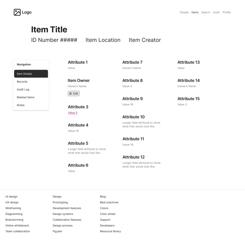
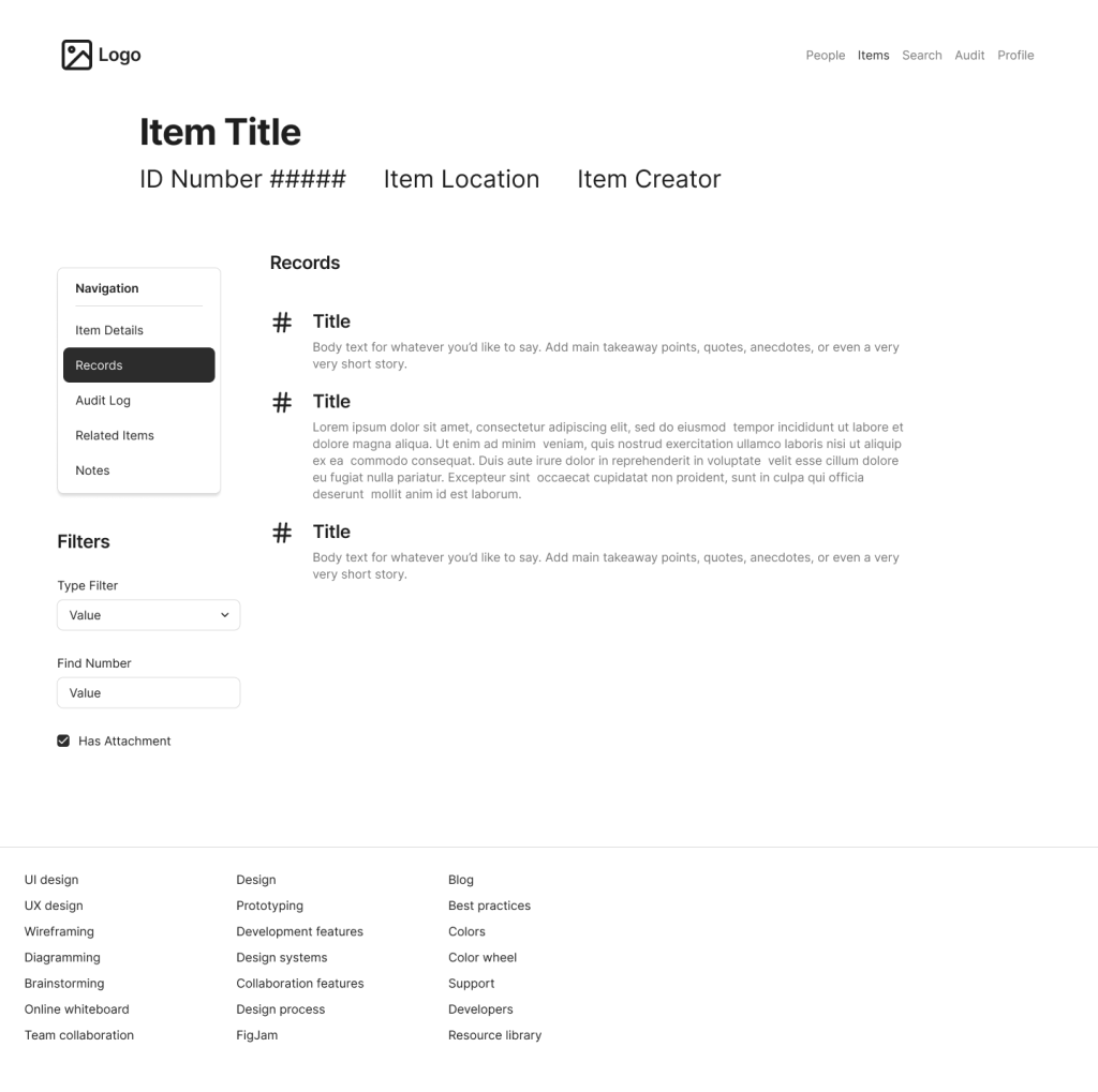
Below are some recreated screens based on the prototype I created for this project. Due to contractual requirements, I cannot share the actual prototypes I created for USTP. To differentiate these samples from the original prototypes, I made these using Figma’s Simple Design System (rather than USWDS), I shifted the placement of various controls, and I changed the labels and iconography to apply to a similar but not identical application.
Sample 1: Item Details
Sample 2: Item Records
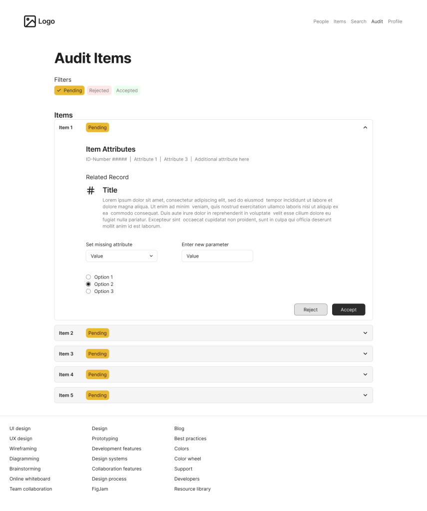
Sample 3: Audit Items View
Outcomes and Lessons
Outcomes
We released our app to production, to a small but growing body of initial users.
Our application was released to production on USTP’s systems. The initial release was accessible to a small sub-group of USTP employees, and then we gradually expanded the user pool as we received feedback and added more features. Initial response to our application was positive. Users reported significant improvements on task completion times; tasks that were quite laborious using the legacy system became incredibly fast and easy with our solution. Users also had more information at their disposal, and clearer guardrails, which reduced errors and cognitive load.
Further, as part of our release, we established an in-app feedback system, which resulted in a continuous pipeline of user feedback. This feedback was then used to help prioritize future design and development.
Lessons Learned
Sometimes you have to pivot. Our initial plan for how we would implement our solution made sense at first. However, as we got into production, we realized the value of prioritizing features that support the entire program, rather than focusing on one bankruptcy chapter at a time. This allowed us to get more users into the system more quickly, and thus increase the amount of feedback we received.
Collaboration produces results quickly. We were able to produce a high-quality application in a relatively short time, with a small dev team, by relying heavily on collaboration. Parallel work done in the same room reduces the need for documentation, meetings, and waiting. This was a significant change from how I used to work, but it has made me a better designer as a result.
Accessibility Testing is both easy and hard. It is easy because once you know the principles, many problems can be resolved by simple changes. It is hard because it requires deep knowledge and understanding of different experiences and technologies, and awareness of things that many people take for granted. I overestimated how much I knew about accessibility before taking my training course, and the learning experience was both fascinating and humbling.